Technological Corporation of Andalusia (CTA) has launched a new corporate image to face a new stage of growth and support for innovation. Close to turning 15 years of existence, CTA has opted for a more modern and versatile image, adapted to its position as a strategic ally to fact-track innovation.
The new corporate image has been worked with Estudio ffuentes., specialized in branding and visual communication and recognized with two LAUS awards given by the ADG-FAD (Association of Art Directors and Graphic Designers).
The corporate image change takes place just after the CTA Board of Trustees has appointed Francisco Mochón as the new president of this Foundation dedicated to promoting R&D + innovation.
Fast-track your innovation
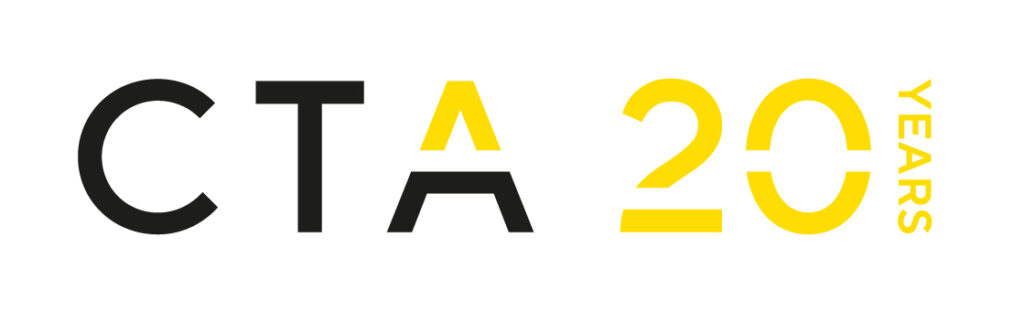
The new claim of the CTA brand is “fast-track your innovation” and the new logo starts from a geometric sans-serif typography, personalized with a horizontal cut in its last letter (A), giving identity and generating a value code. The lower part of the “A” represents the business cluster (under the umbrella), while the upper part shows the change and growth through a yellow arrowhead pointing upwards, which accentuates the concept of innovation with the color transformation and it works as an isotype.
The identity is created with a visual code, lines and cuts aligned with the brand that generate its own system.
The CTA image update is in line with the latest corporate design trends, in which functionality and applicability prevail. In addition, the change of image solves some deficiencies of the previous logo, which had been outdated and presented some problems of scalability, printing and readability.
Adaptability and flexibility
The logo typography is part of the TT Norms Pro Medium family, personalized with a different kerning setting in its letters, achieving greater legibility and brand solidity. Colors have been simplified to two inks: Pantone Process Black and Pantone Yellow. In addition, a color and icon code has been developed to identify the 7 economic sectors in which this business cluster operates.
Pure lines, geometric shapes, color simplification, adaptability, modernity and versatility are the keys of the new corporate image.